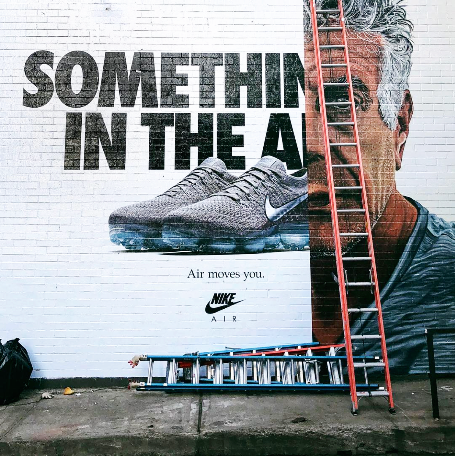
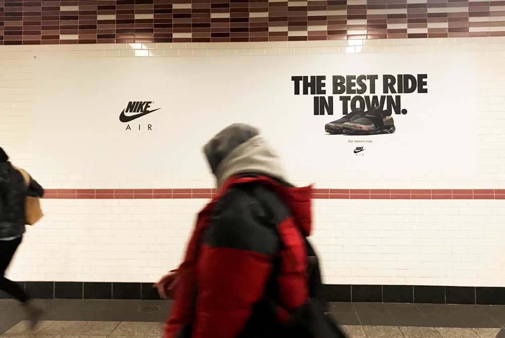
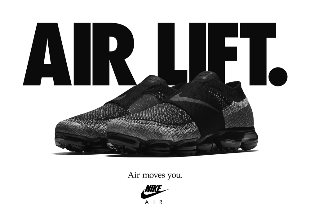
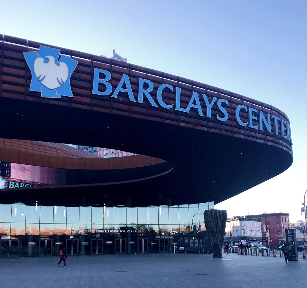
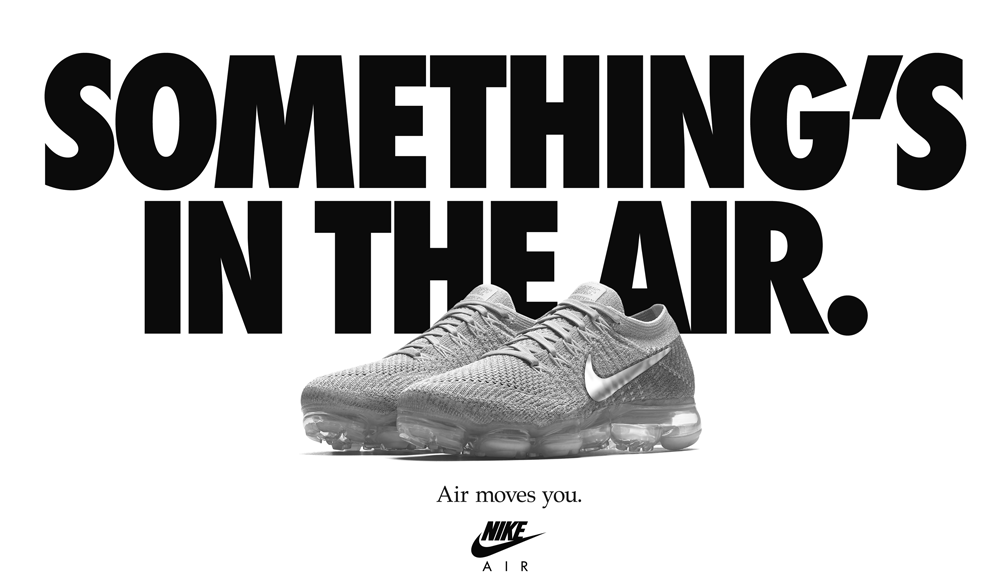
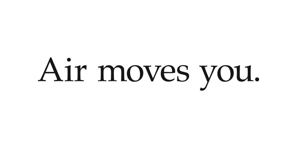
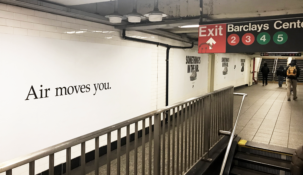
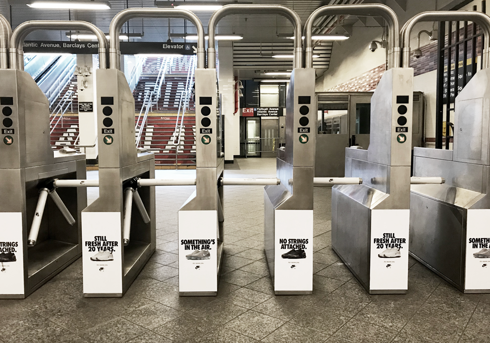
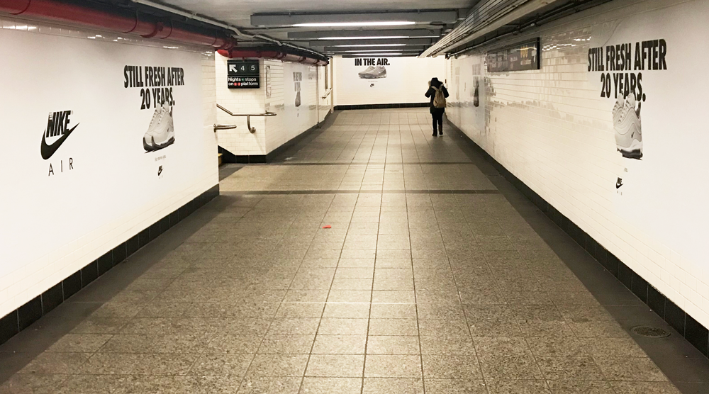
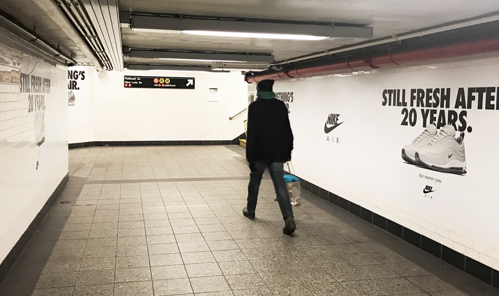
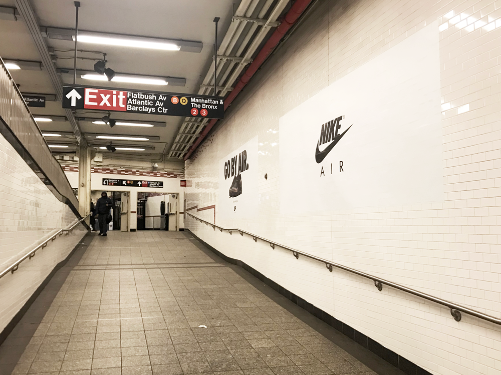
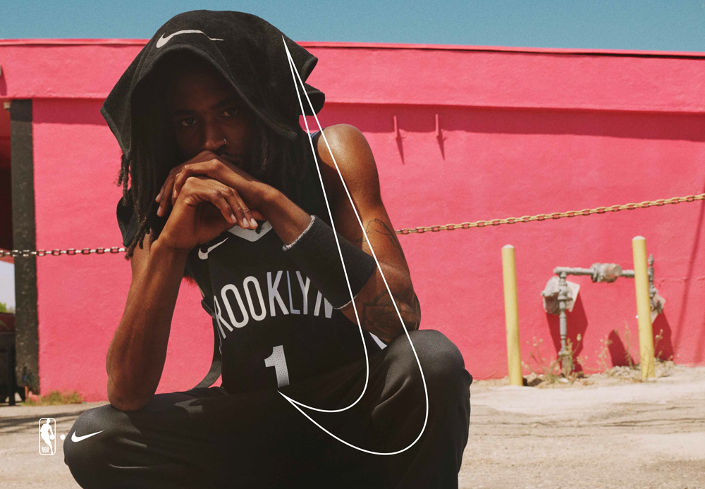
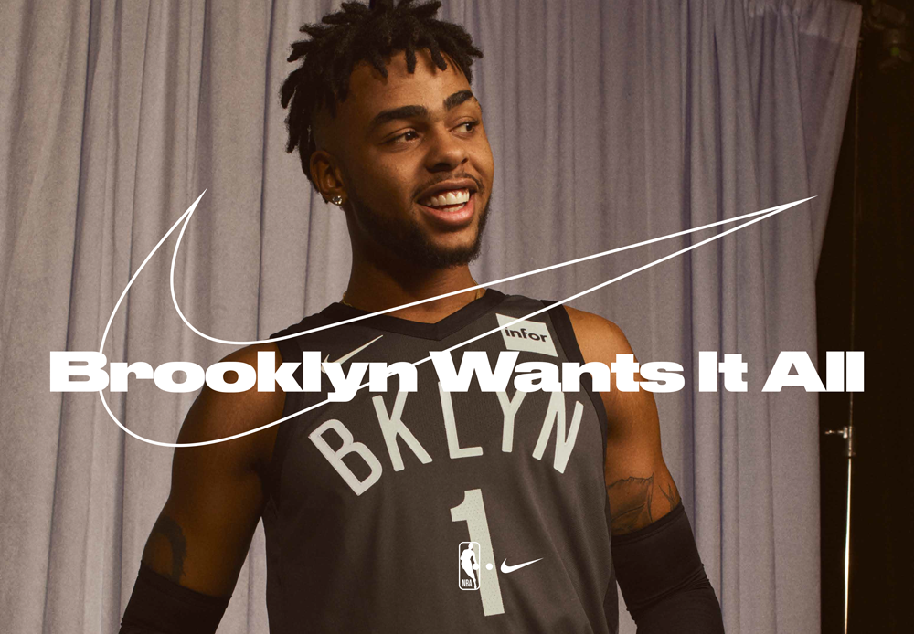
NIKE ATLANTIC AVENUE STATION DOMINATION
We had the opportunity to help develop the Atlantic Avenue Station Domination ad campaign for Nike. This was a complete station takeover outside the Barclays Center in NYC. This ad takeover had a minimalistic aesthetic and relied strictly on bold typography and the products—highlighting the 20 year anniversary of Nike Airs.
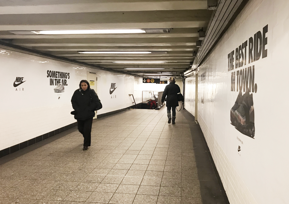
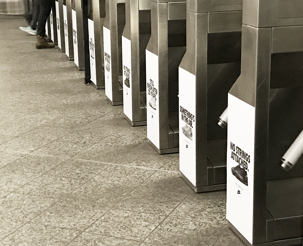

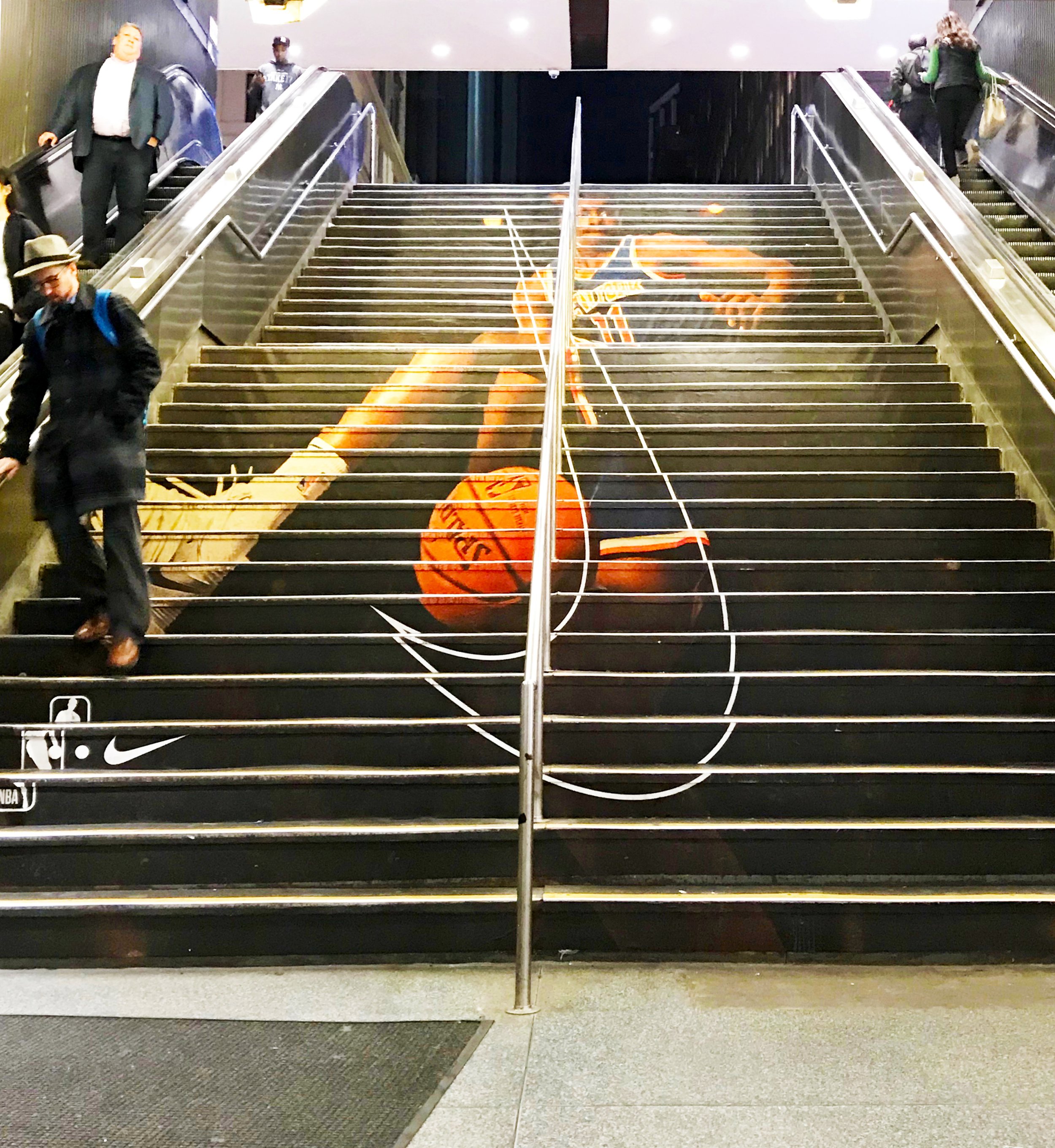
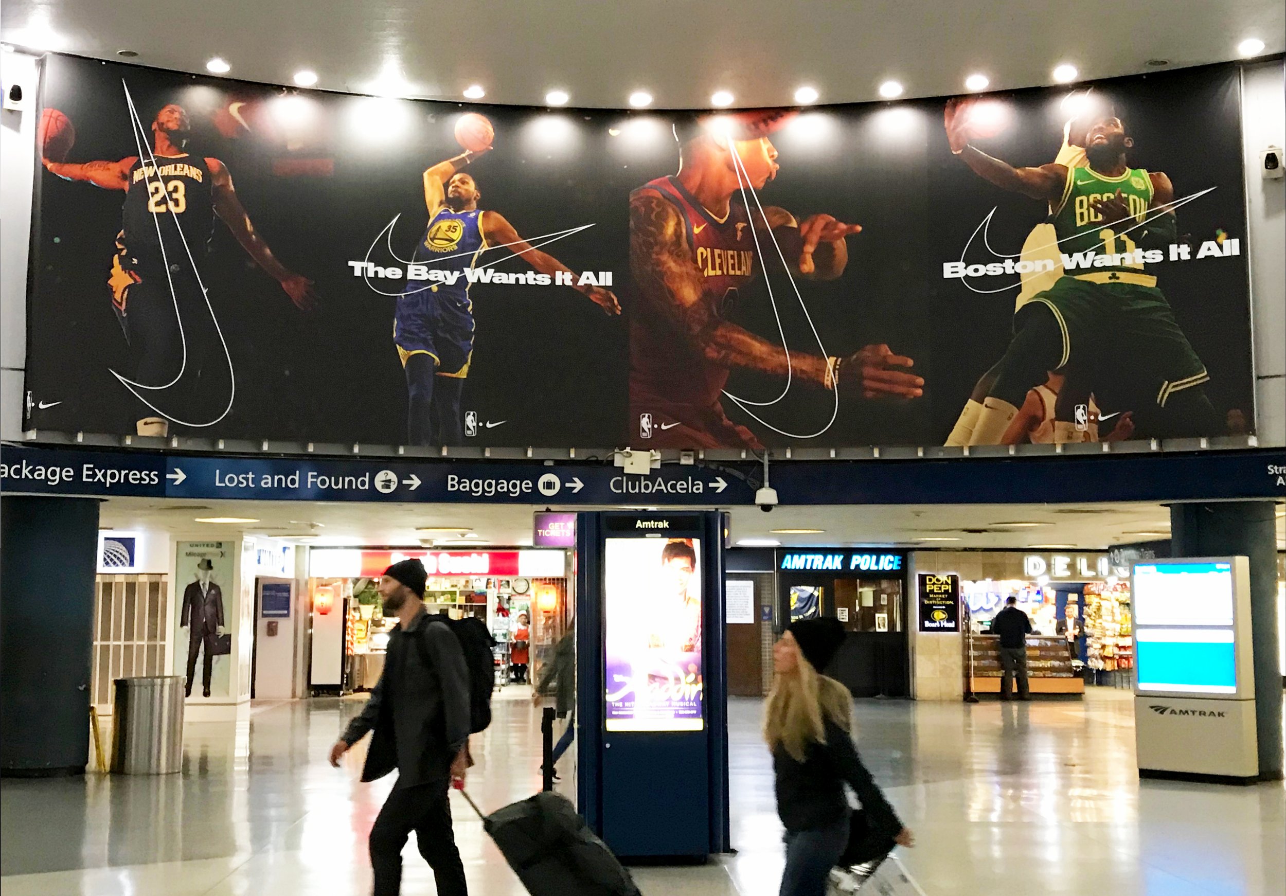
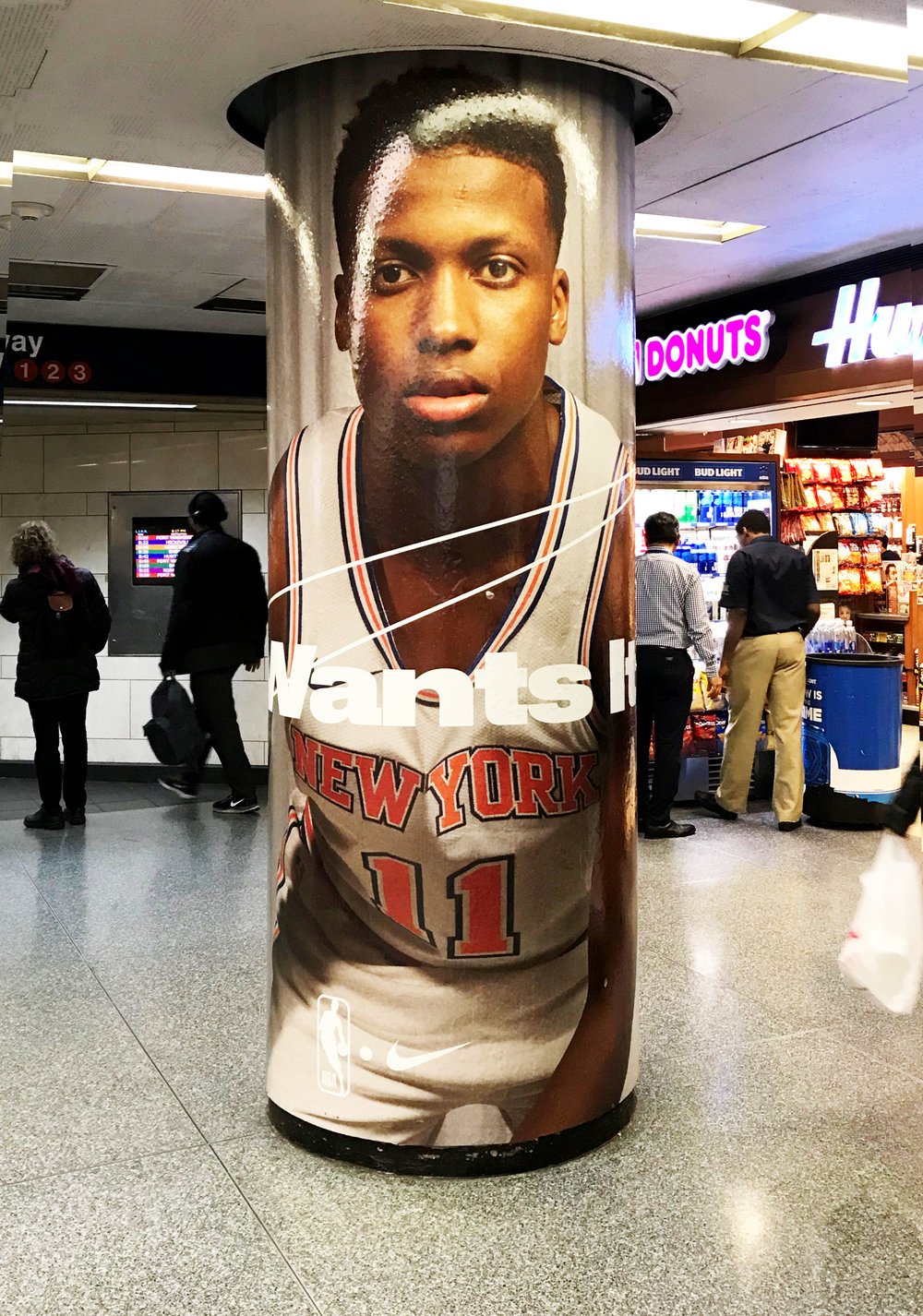
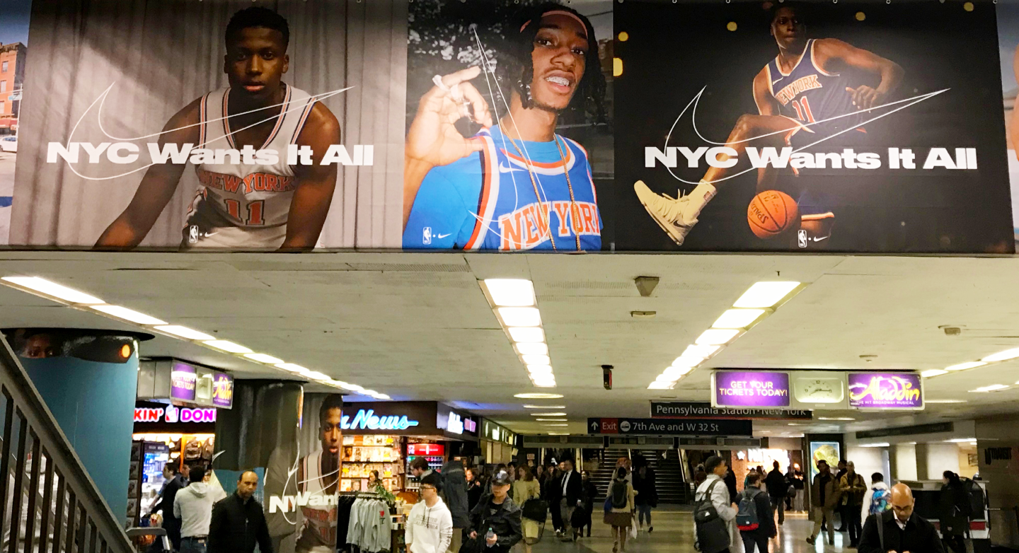
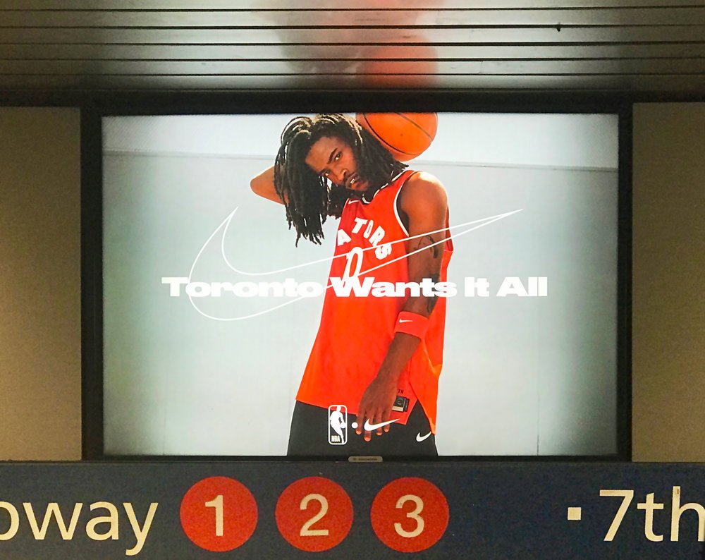
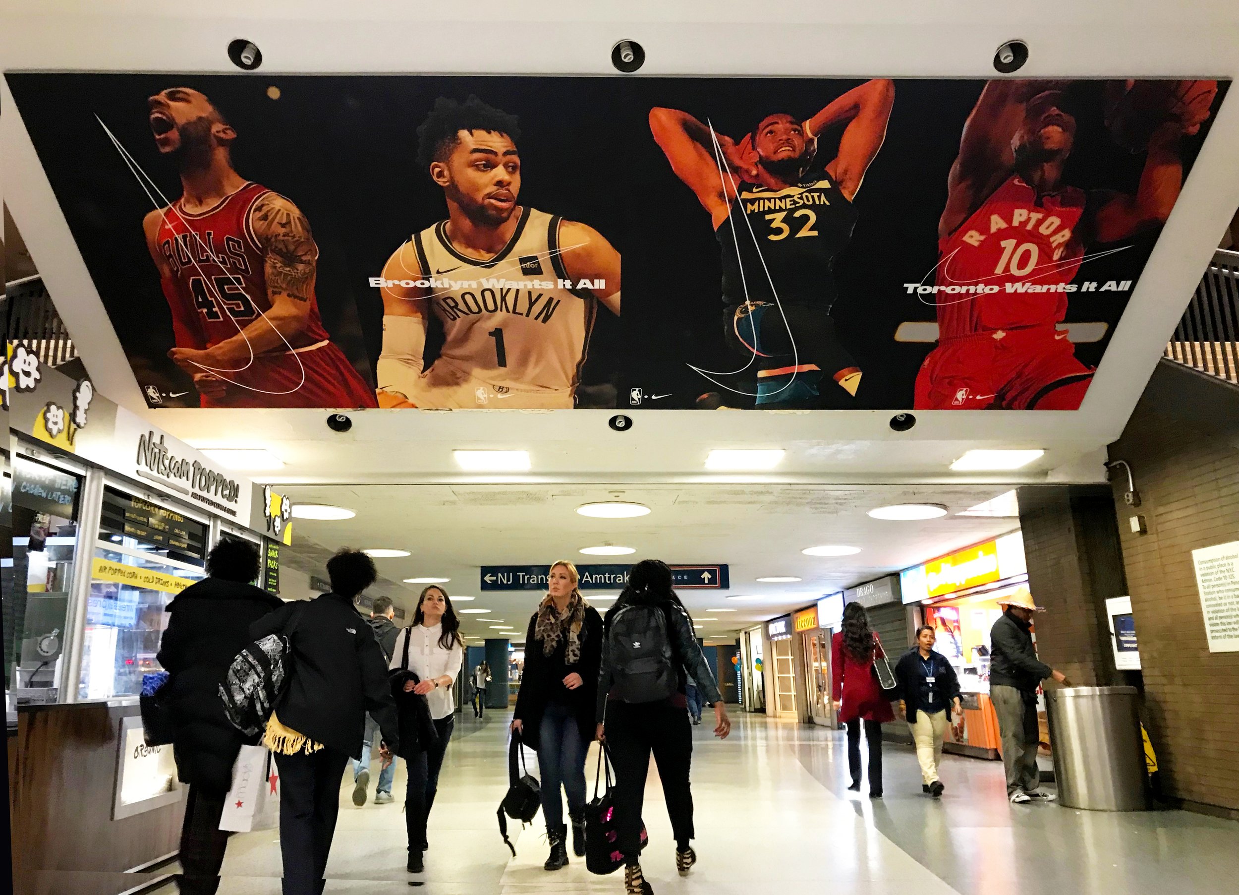
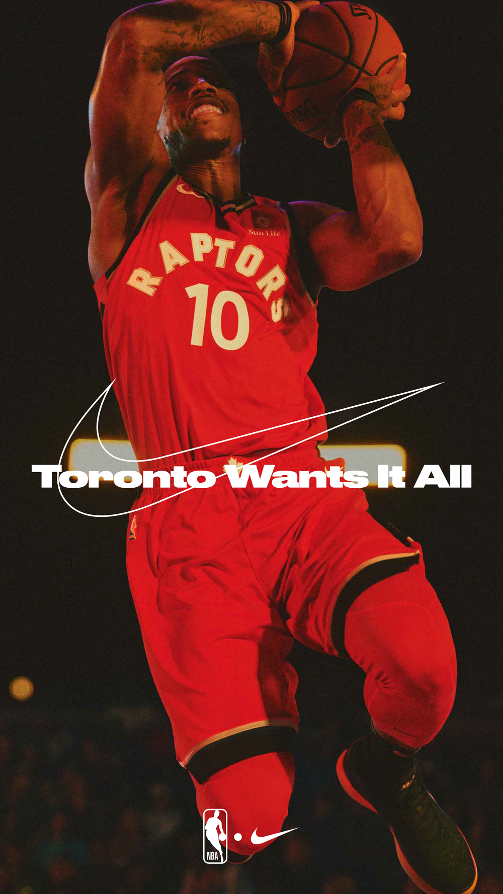
NIKE PENN STATION DOMINATION
We had the honor of helping develop the Station Domination ad campaign takeover for Nike and the NBA. This was a total station takeover. Each ad created impact and suggested movement throughout the confined space. Hundreds of these ads flooded and took over the terminal at Penn Station in NYC.


Motorola Brand + UI Design
At Motorola Solutions, everything starts with safety. It enables the most important things in our lives to flourish, from our families and communities, to our businesses and economies. Motorola Solutions wants to build the future of safety together.
We assisted Motorola Solutions with a brand refresh, advertising design and a reskin of their website. Multiple directions were presented throughout the process, but the direction displayed here was inspired by framing the everyday moments. Motorola is creating the safe space to make those moments possible with ease.

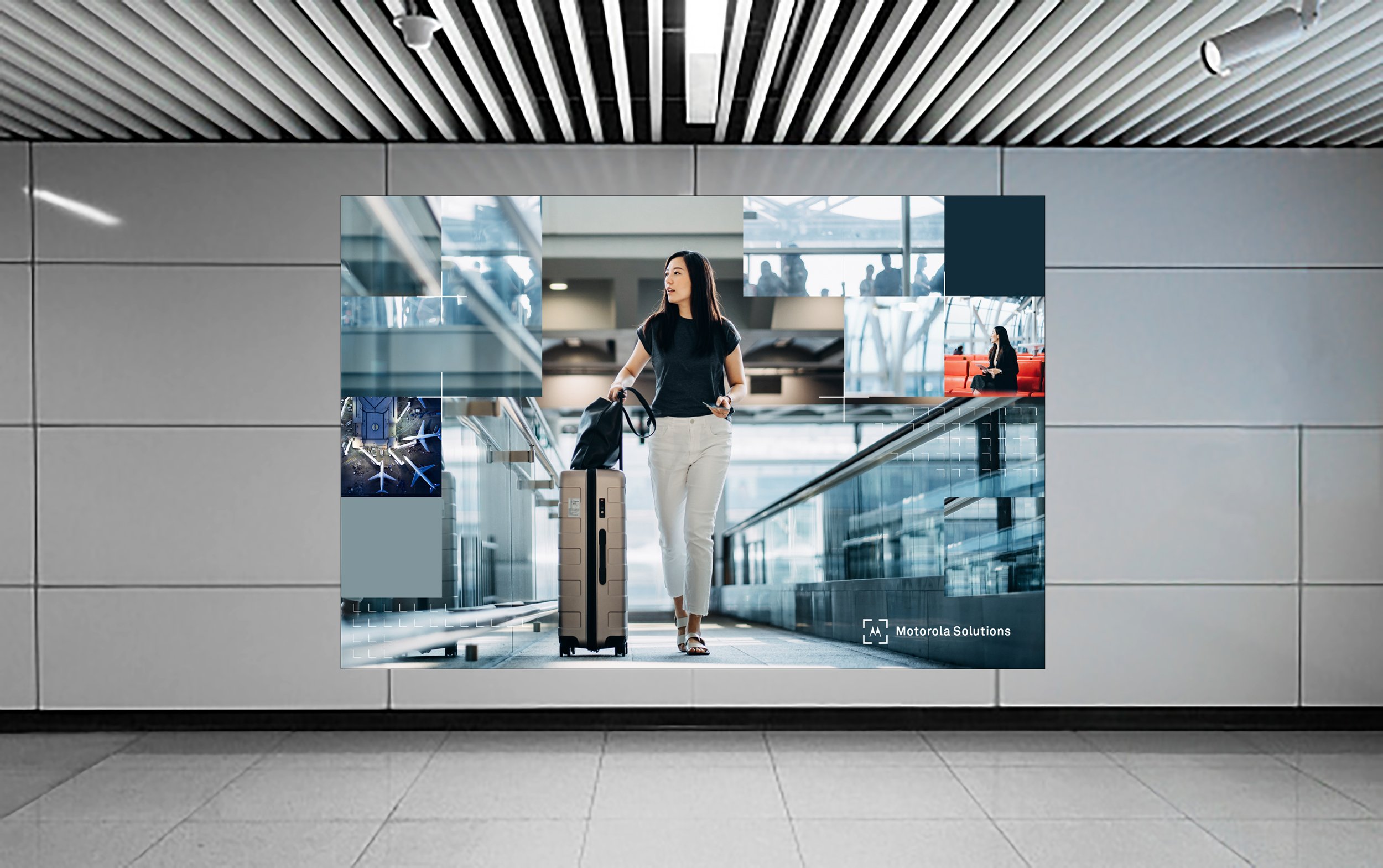
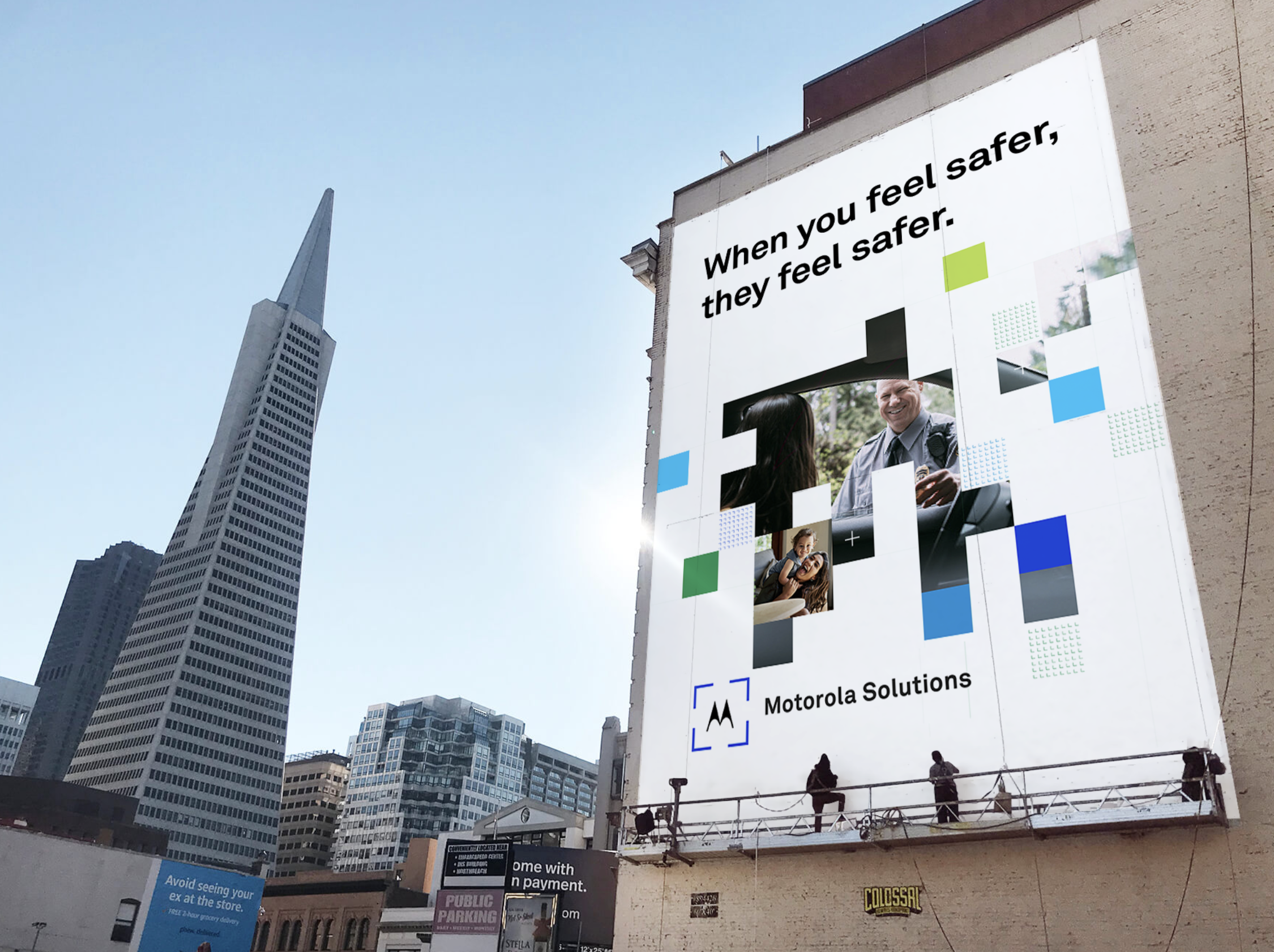
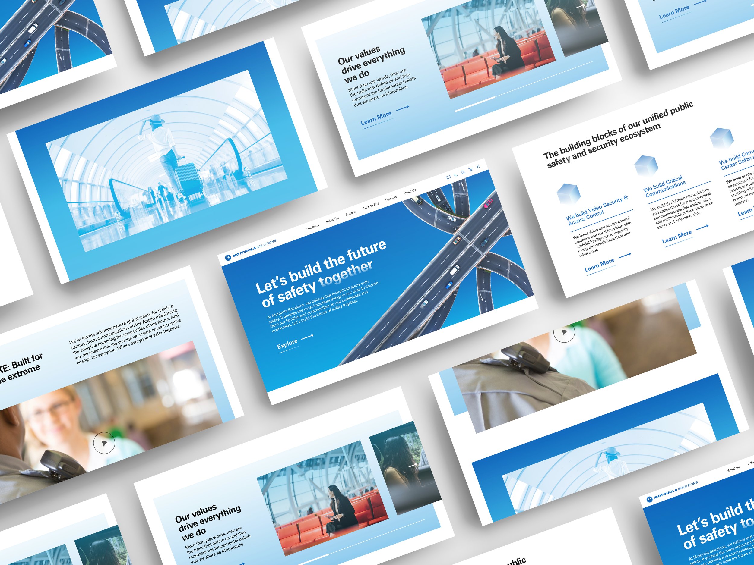
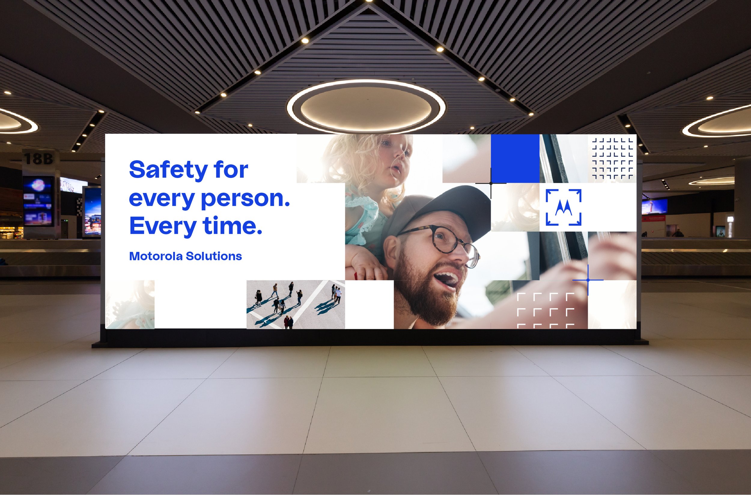
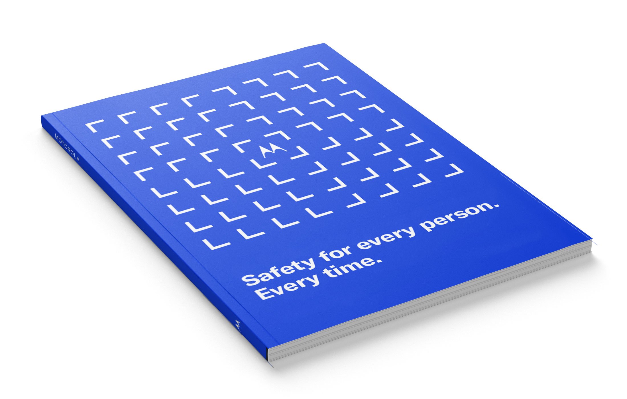
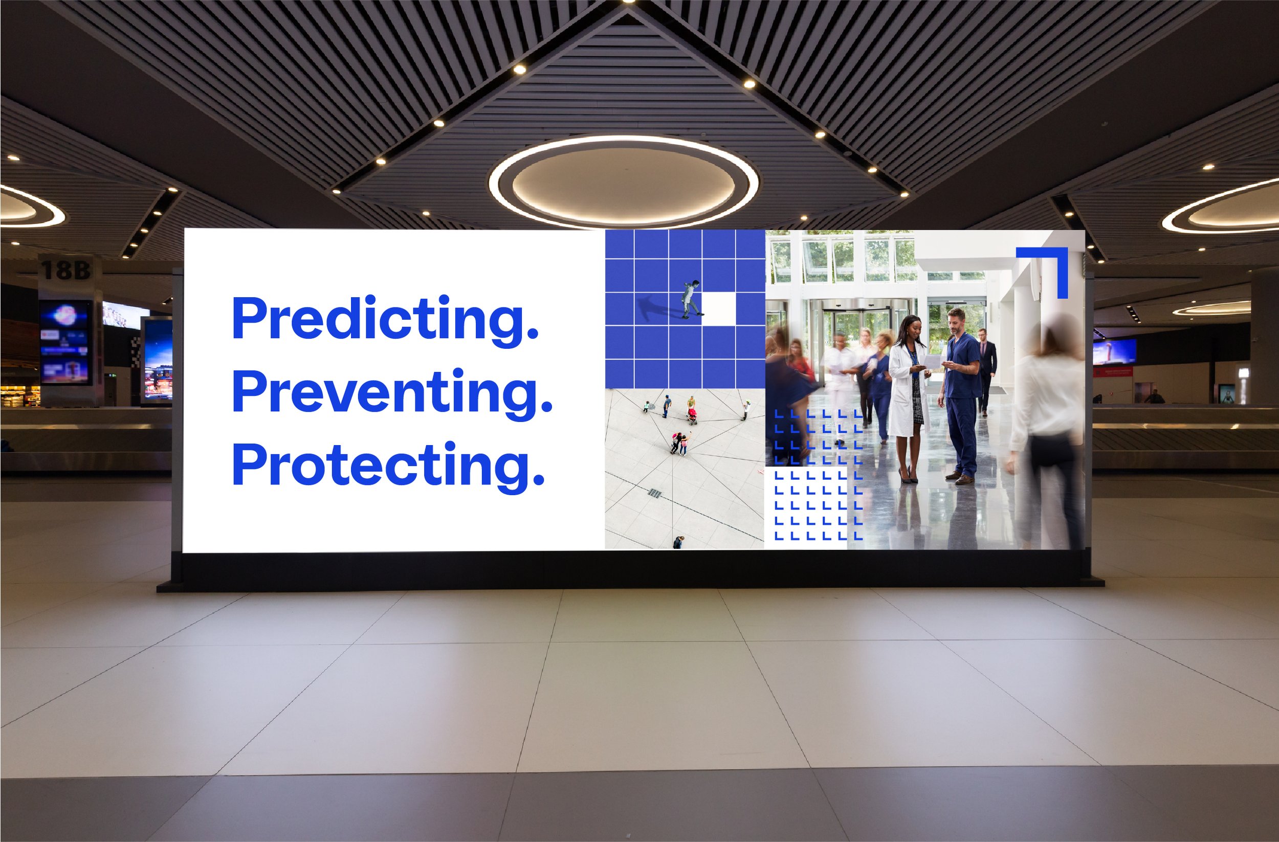

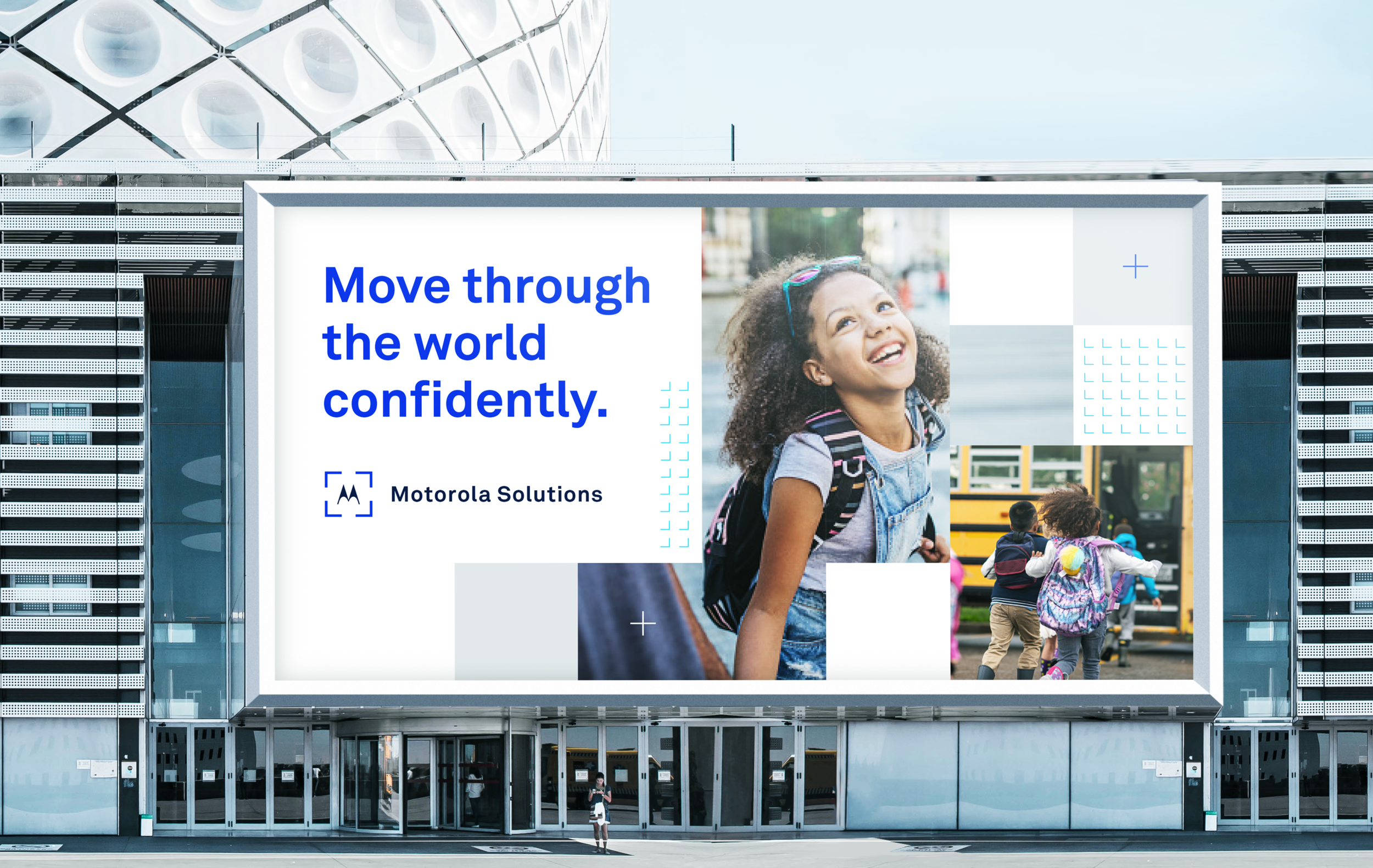

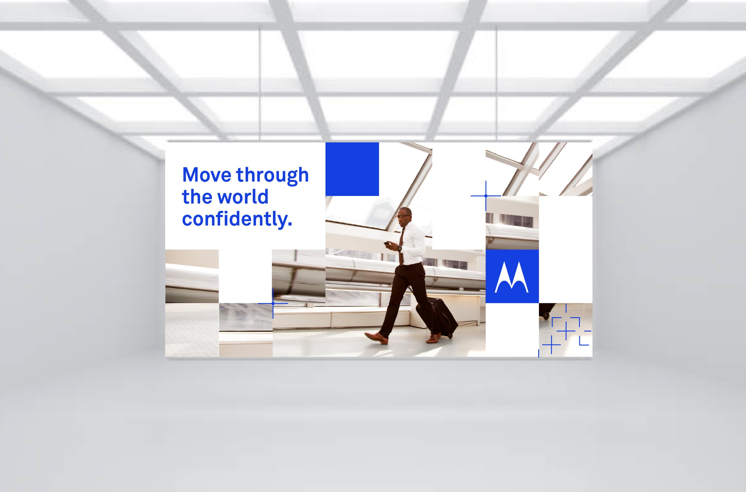
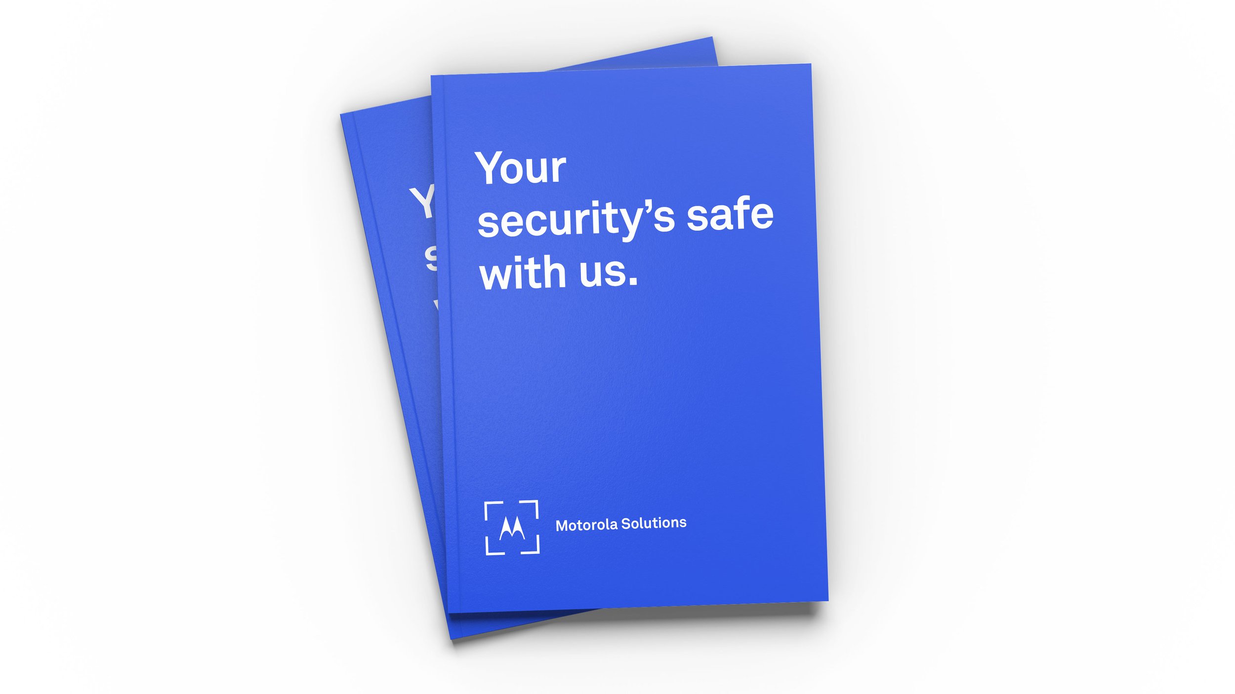

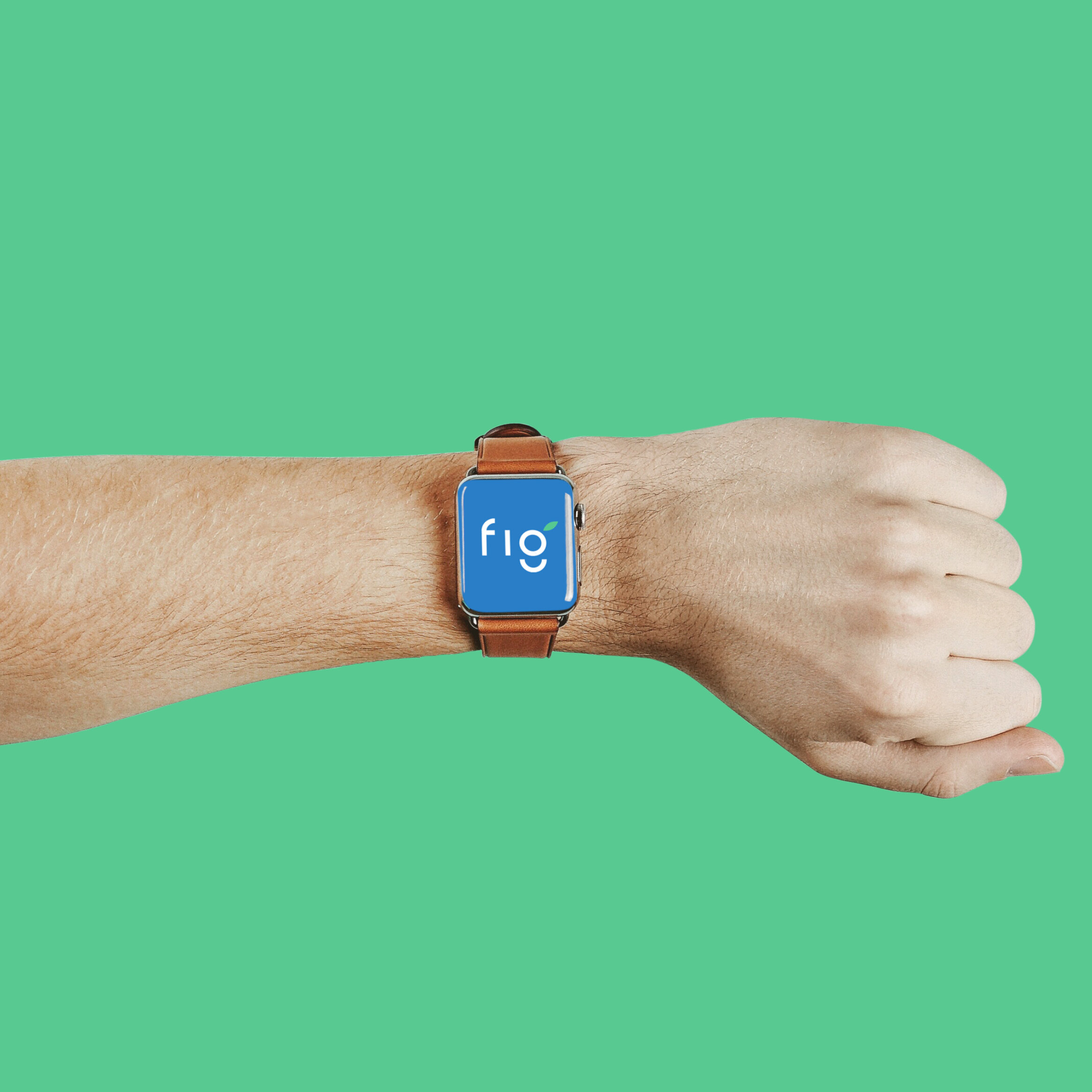
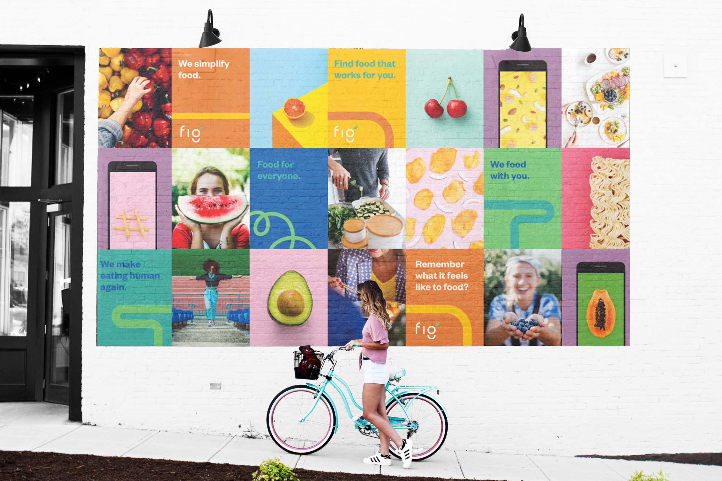
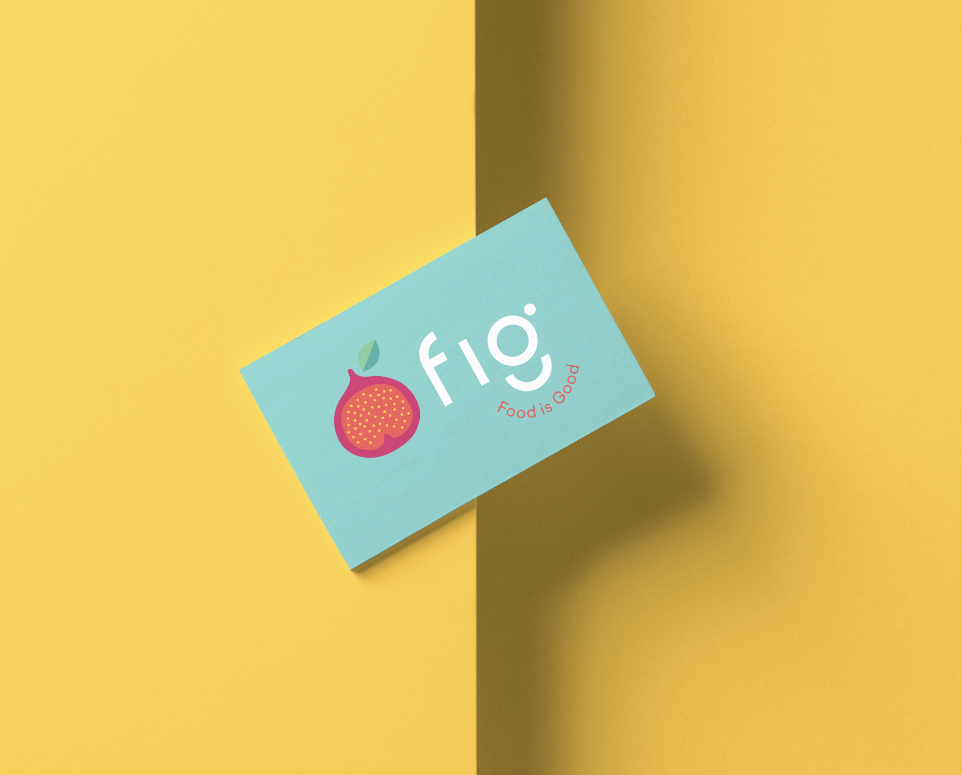
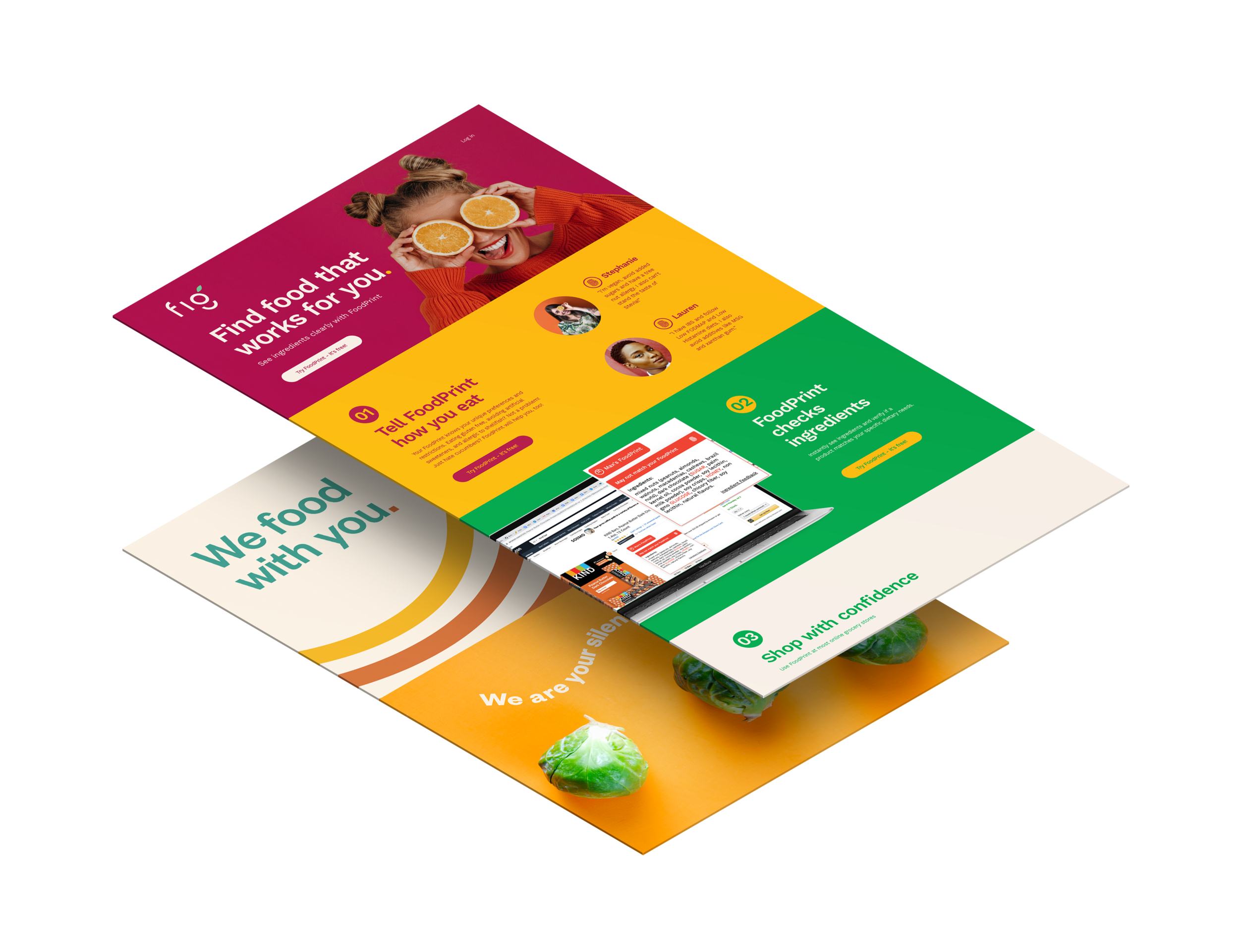
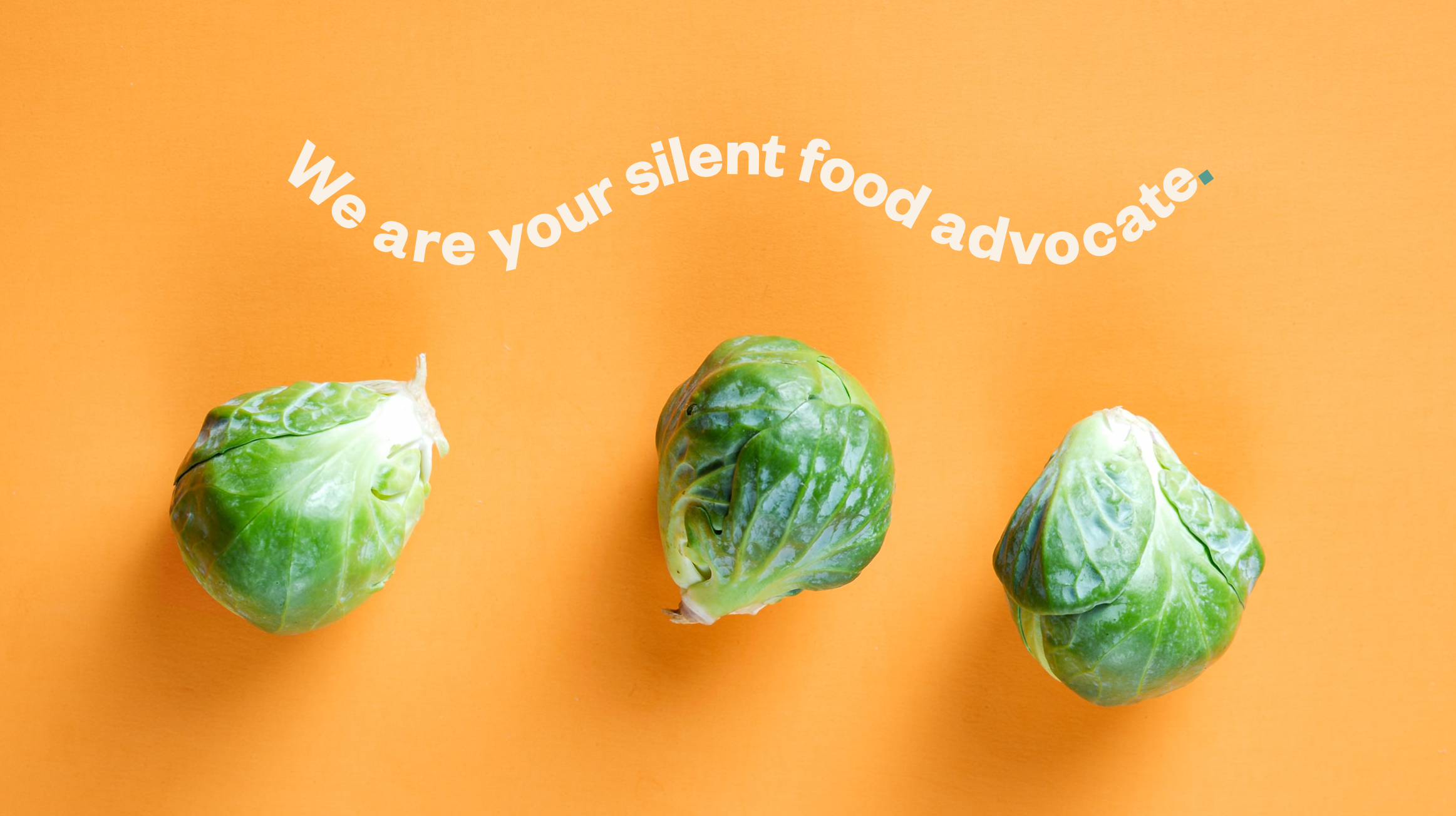
Fig Brand Design + Development
Fig or “Food is Good” is building a world where everyone can eat freely and flourish, regardless of their dietary needs. Living with dietary restrictions is hard! That’s where Fig (your own personal diet profile), comes in to play. Tell Fig how you eat, and Fig will instantly show you all the options that match your unique needs at grocery stores, recipe websites and even restaurants!
We assisted with the creative direction of the Fig brand, which included naming, brand strategy, brand design, advertising and UI design.


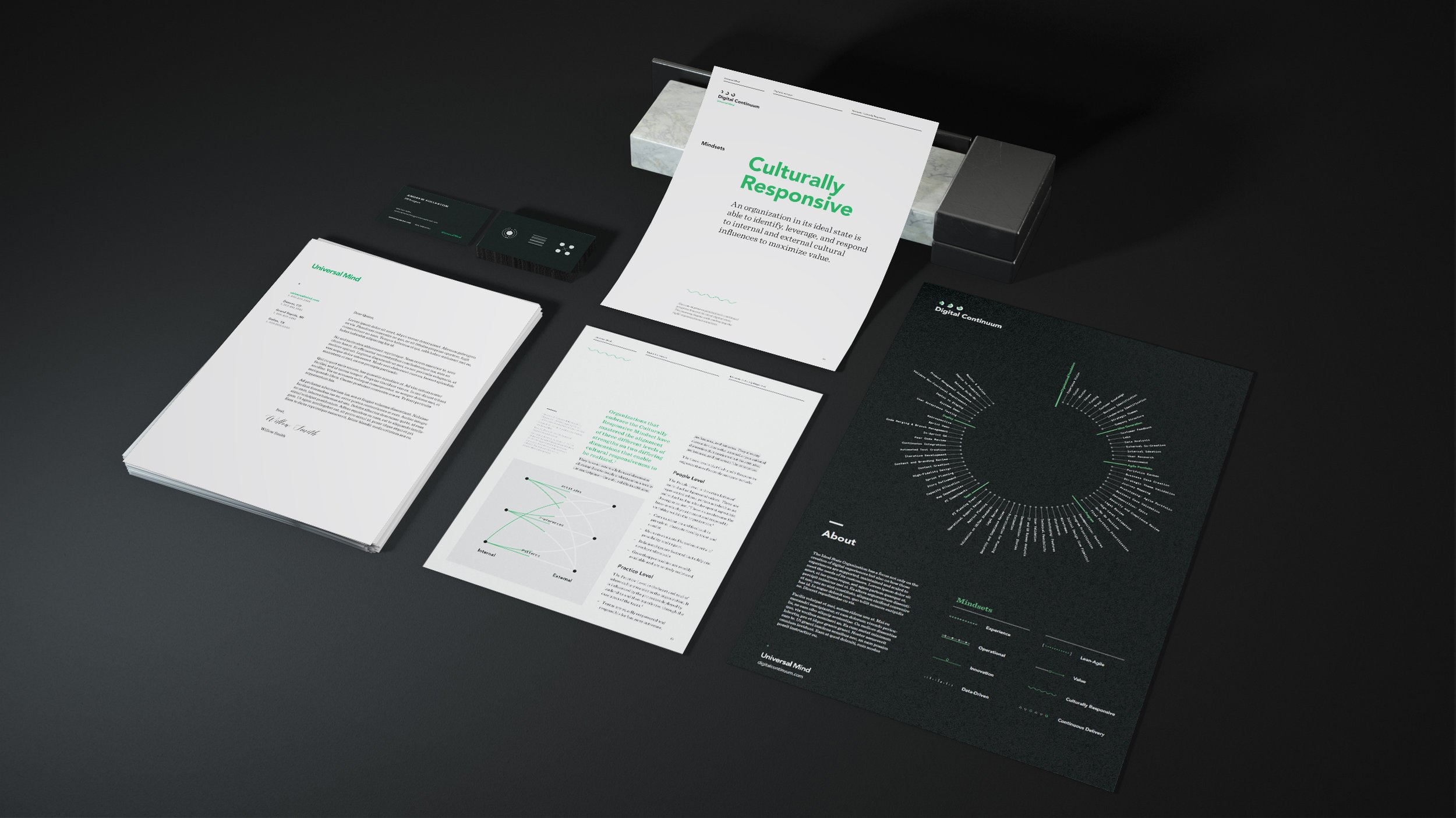
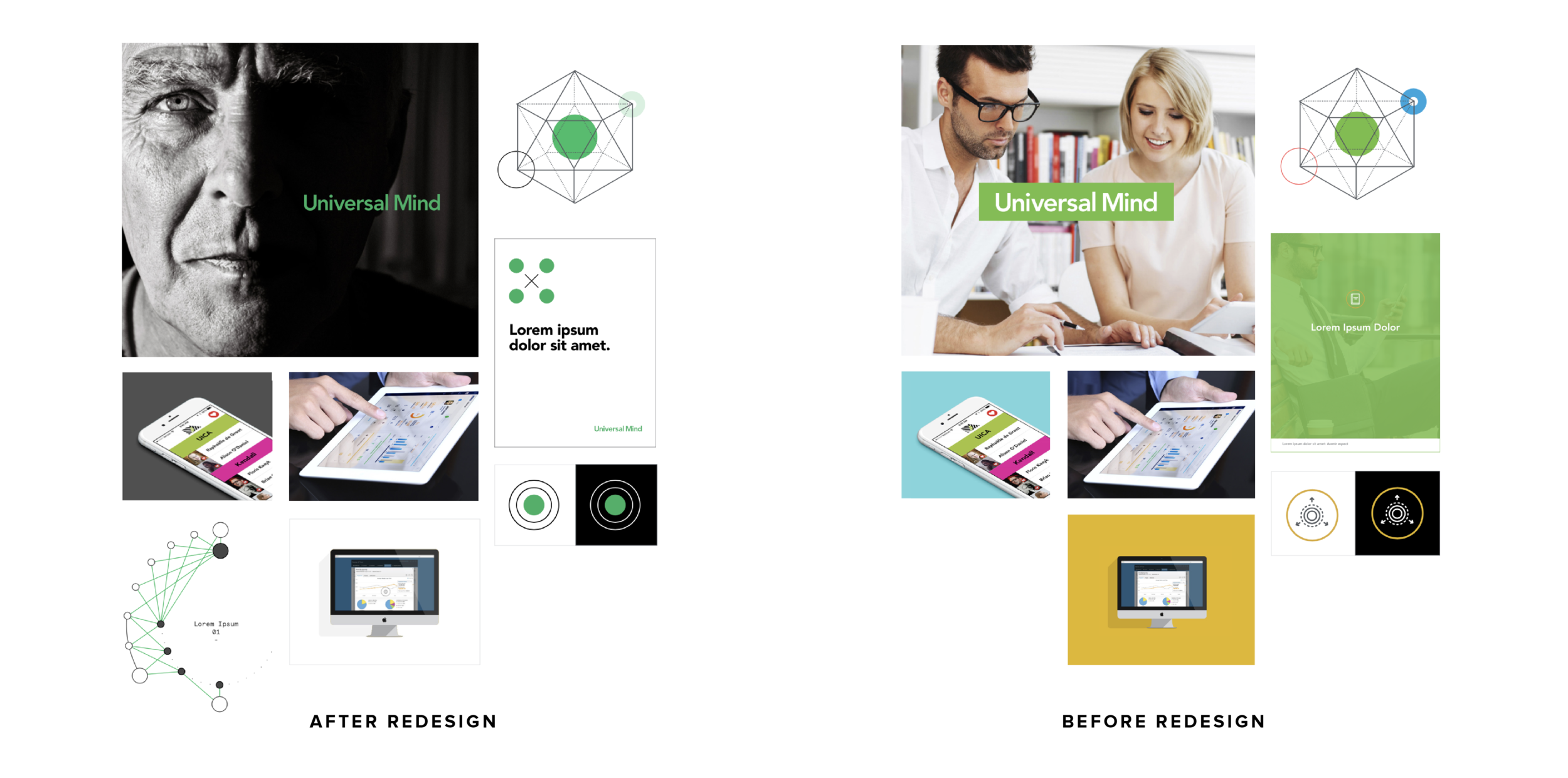
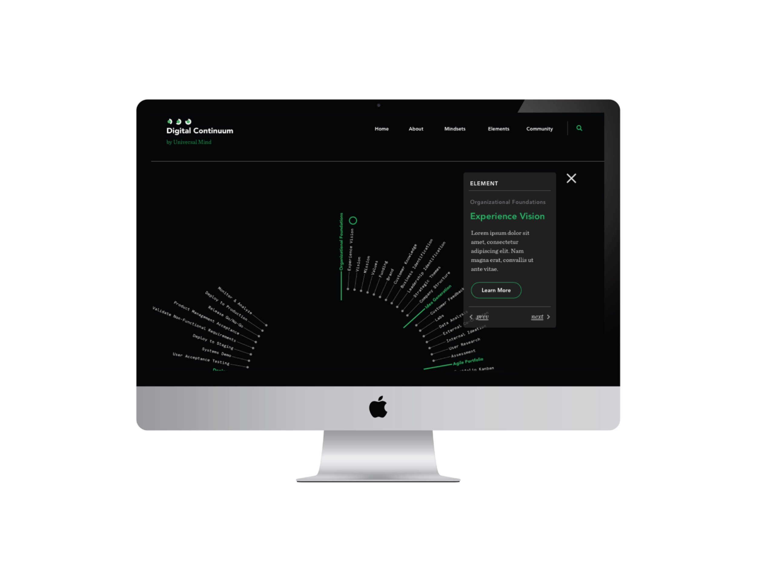
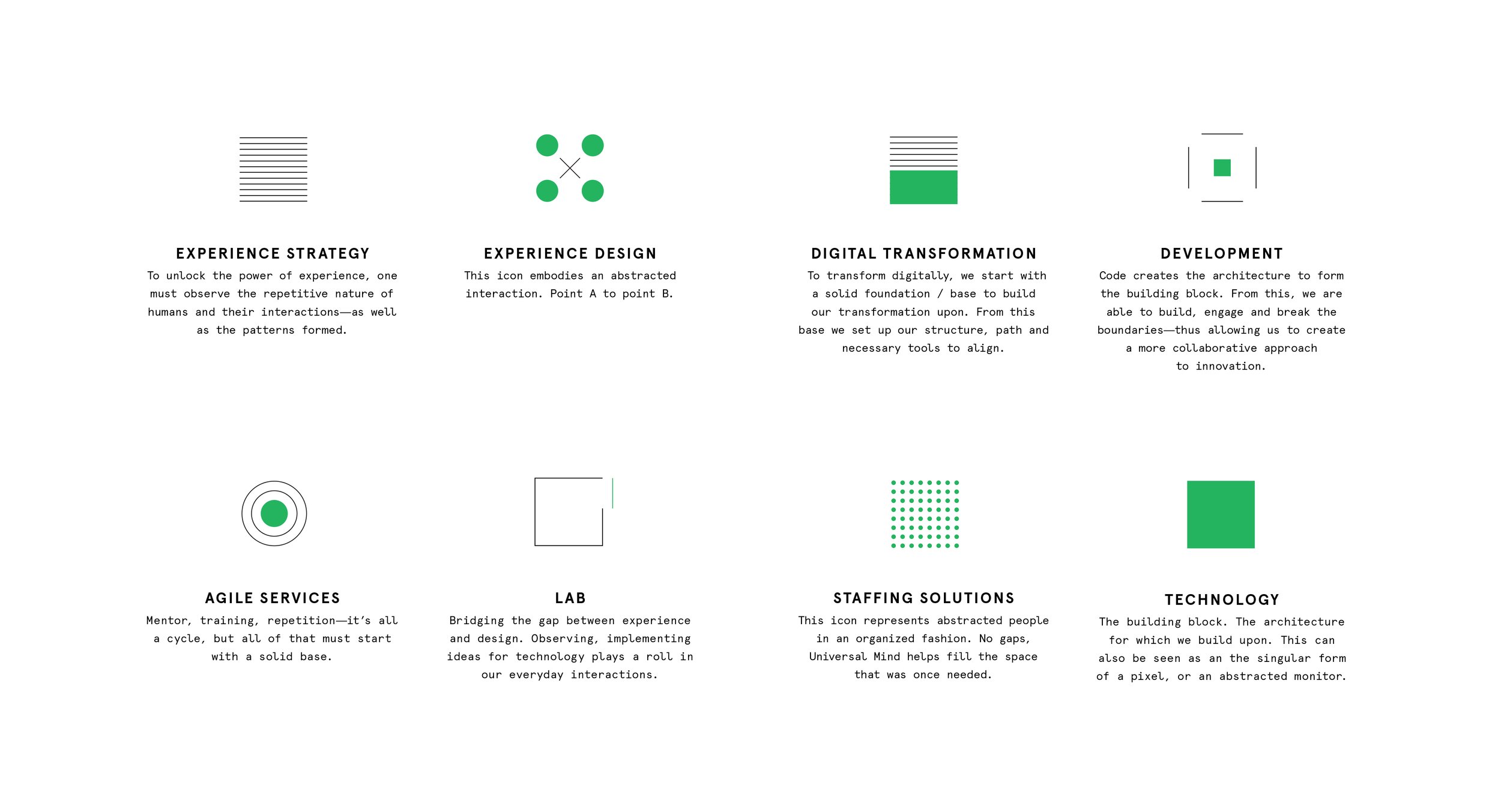
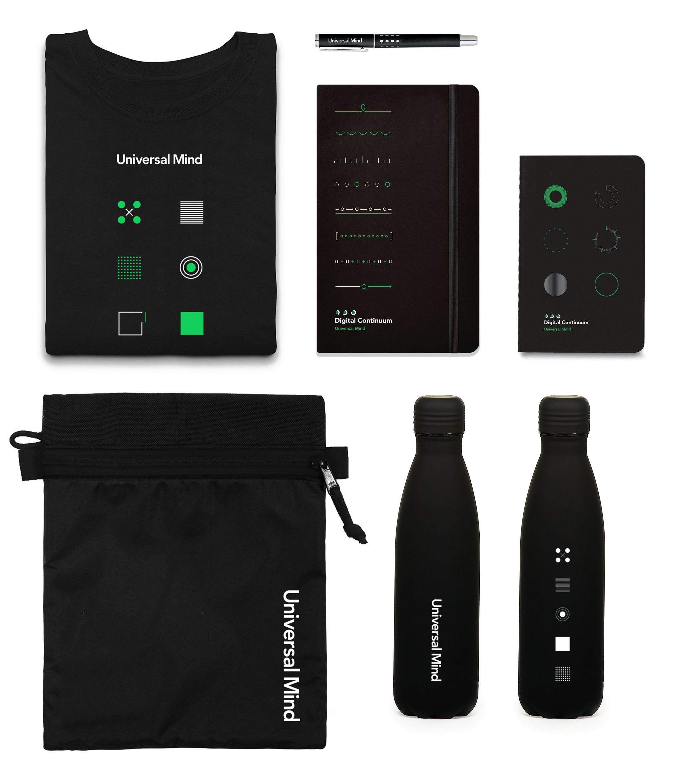
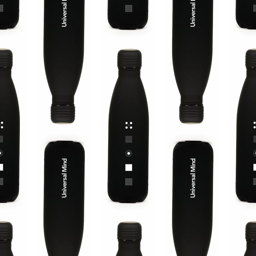
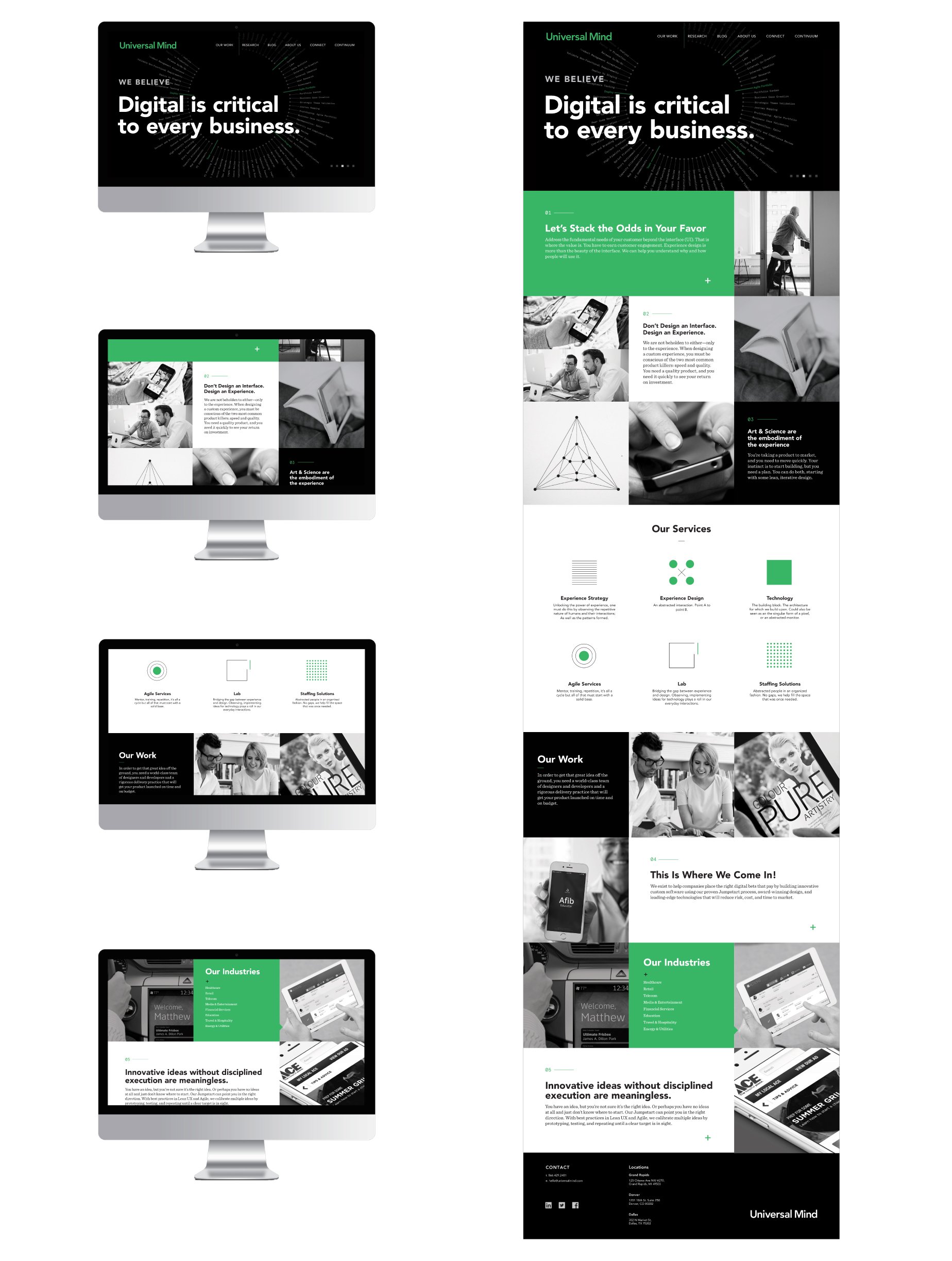
Universal Mind Rebrand + Brand Extension
We were brought on for a rebrand and brand extension for Universal Mind—previously one of the largest independent digital agencies in North America. Universal Mind was restructuring their organization and with the rebrand they were hoping to achieve elevation as an organization and cater to C-Level clientele. They were looking to streamline their business into the corporate structure and with that, they sought to extend their sales efforts with a rebrand and brand extension known as the “Digital Continuum”.
When entering the project, it was apparent with Universal Minds’ new direction they needed to strip down their color palette, create a more minimal, point driven message. The previous brand implementation and design was cut and pasted together by a plethora of different designers with a multitude of various backgrounds. Universal Mind lost consistency and a brand voice. Which is right where we started when considering the brand direction.
We worked internally with the marketing, development and sales team at Universal Mind to develop a bold brand persona, voice—as well as develop a whole new visual identity and two websites.


MoMA Exhibit Poster Series
Our CD, Rebecca was given the opportunity to design a poster outlining the calendar year of exhibition dates for the Museum of Modern Art (MoMA).
Pure typography was used to embody the poster. The type used accentuated the MoMA’s simplistic and bold brand identity while highlighting their logo. To expand upon this idea, rather than limiting the exhibition information to one poster, she chose to transform the concept into a series of five posters. Each poster detailing 2-3 months of exhibition dates.
The posters are bold—both graphically as well as in their use of color. This beautifully displays the MoMA’s overall brand aesthetic, as well as the exhibition list of events. Additionally, she wanted each poster to be able to exist as a bold, abstracted and singular piece—but when brought together, they join to become part of a larger language and overall form.
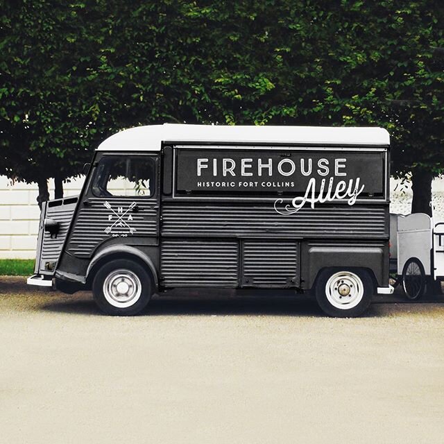
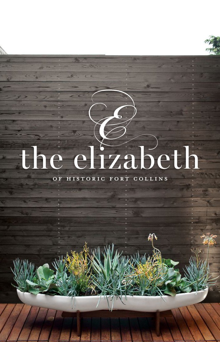
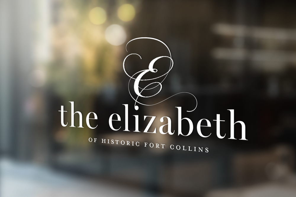
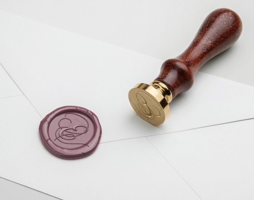
The Elizabeth + Firehouse Alley Identity Design
During this project our CD, Rebecca was asked to create the brand identity for “The Elizabeth Hotel”. Named after the notable land owner—Elizabeth, the hotel was breaking ground in a historic corner of Colorado, below the Rockies. It was her goal to pay homage to Elizabeth—with a touch of class and elegance in the logo mark. She wanted to carry through this same idea in the overall brand identity and collateral we designed.
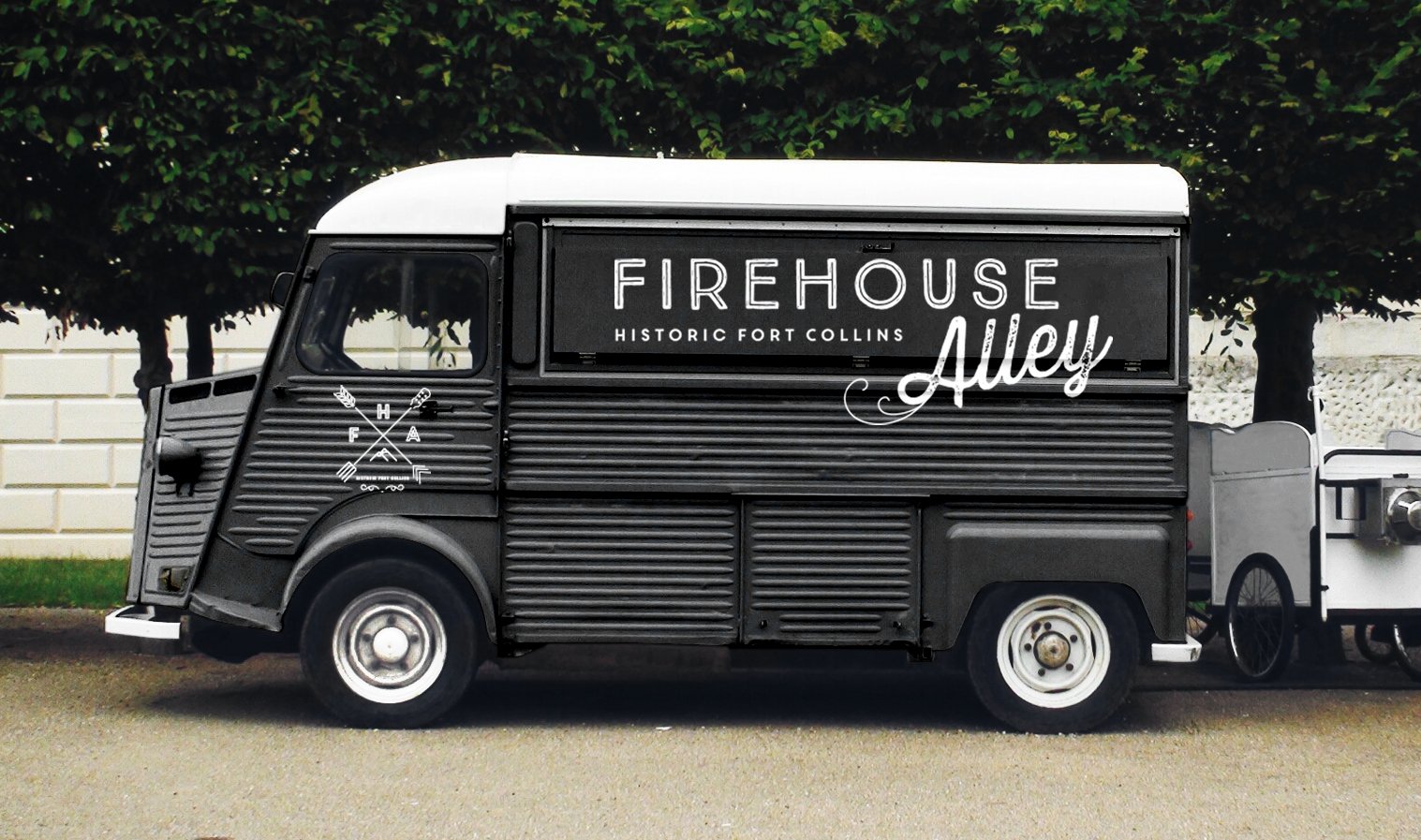
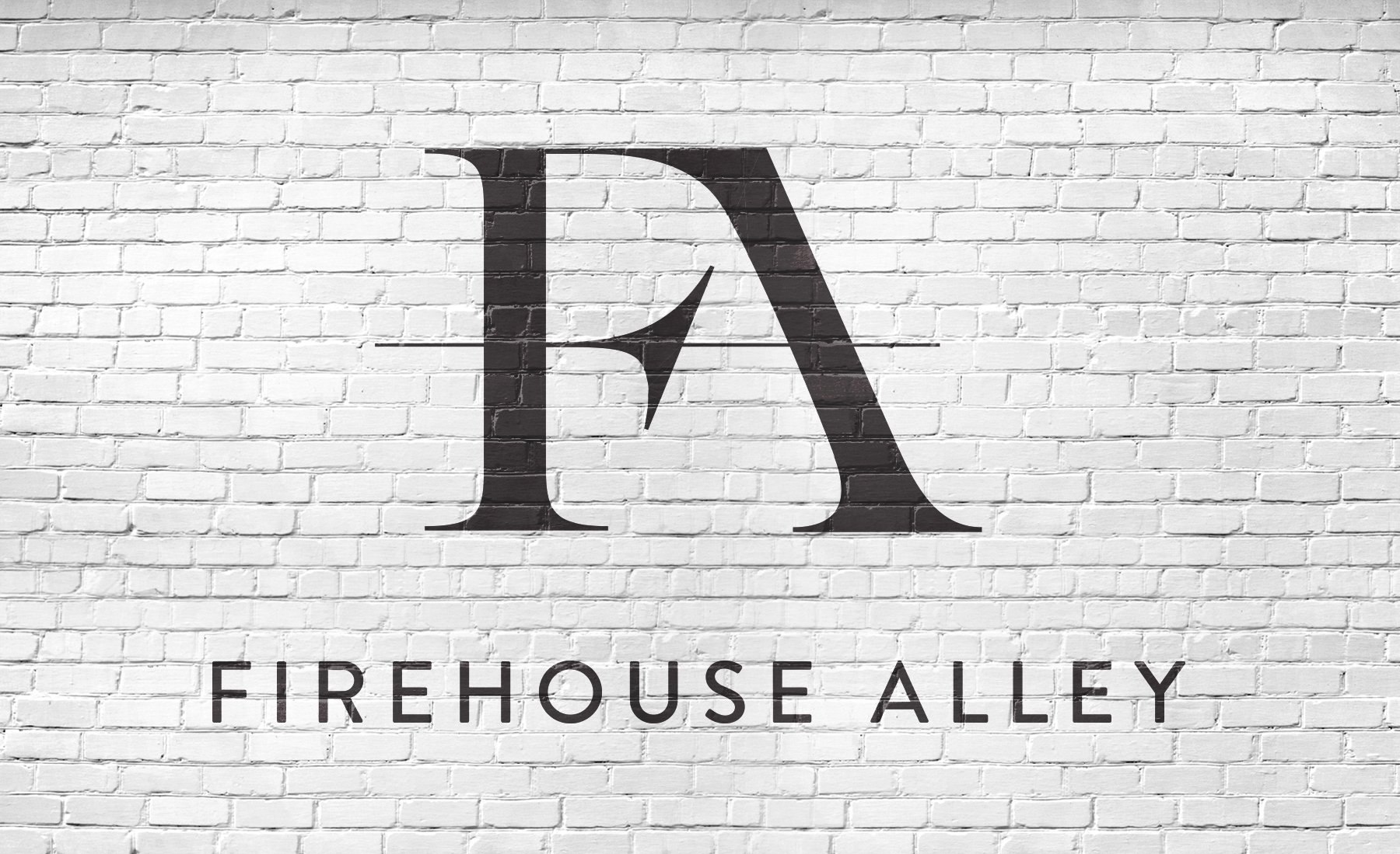
In conjunction with the rebrand, The Elizabeth was joining forces to construct a lively alleyway that would border the hotel and shops along the path. The passageway was named Firehouse Alley, as an old Firehouse graced the end of the alleyway for years. It would play host to music, dining, food trucks, breweries and other indulging delights! She crafted the identity for this indulging attraction, as well as the outdoor collateral in conjunction with the space.


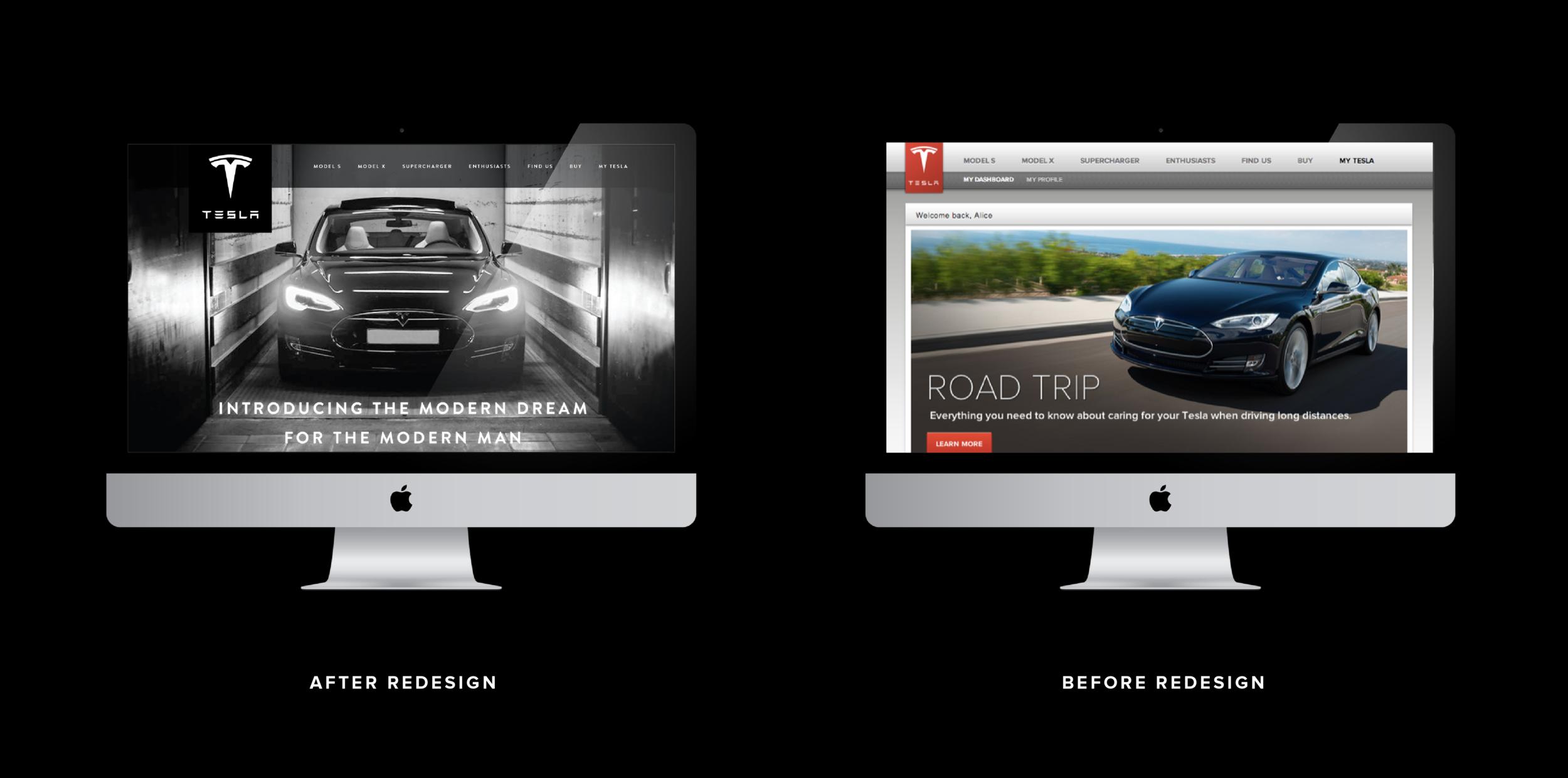
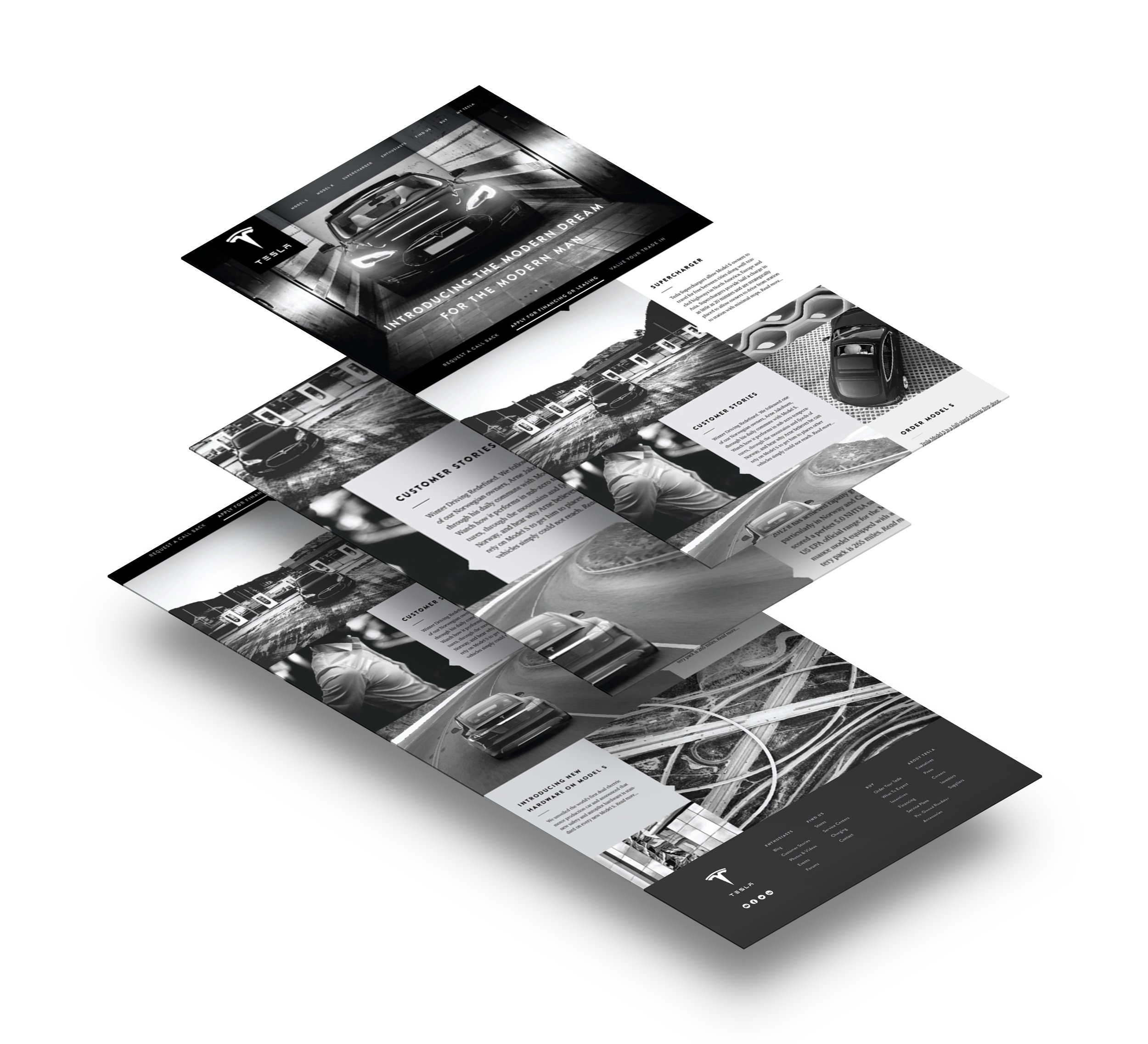
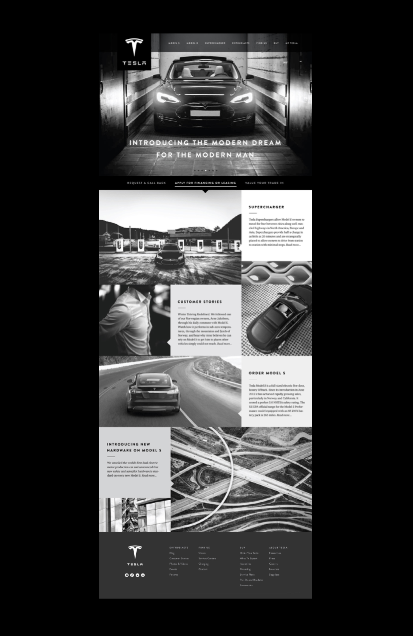
Tesla Website Redesign
During this project we were asked to redesign the visual identity of the current Tesla website. Before the website reskin, the client was leaning towards an older demographic. You can tell this through their previous design (dull color usage, clunky corporate gradients and just outdated). The client wanted to refresh and align their product as well as site towards a younger target audience. This new demographic was urban males between the ages of 25-35. With this in mind, we chose to give their website a fresh look—that was more refined, streamlined, geometric and had high class sense and feel.
It was during this discovery process that we determined we would minimize color usage throughout the site—focus on contrast, make it very clean, geometric and striking. We wanted to focus on geometry and nuisance elements to bring the vehicles clean lines and beauty to the forefront. This enhanced the sleek nature of the Tesla vehicles. We used a gridded layout to achieve this—as well as bold imagery that would draw in the viewer and allow the eye to flow seamlessly throughout the page.
In this redesign, we sought to loose the chunky, stark quality that the current Tesla website was portraying. We gave the proposed redesign an edgier, sleek, more streamlined aesthetic—that was more in keeping with Tesla’s overall brand initiative.
Interested in working together? Let’s talk.
Are you looking to work with extremely talented individuals rather than corporate firms who are just looking out for their bottom line? Look no further! We are natural problem solvers—harnessing strategy and innovation to take our clients’ work to the next level.

The Gram—